- January 10, 2024
- Martha
Color theory plays a crucial role in interior design, influencing the overall aesthetic, mood, and functionality of a space.
Here are some key principles of color theory as they apply to interior design.
1. Color Wheel
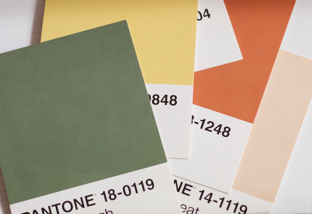
The color wheel is a fundamental tool in understanding color relationships. It consists of primary colors (red, blue, yellow), secondary colors (green, orange, purple), and tertiary colors (mixtures of primary and secondary colors).
Complementary colors (opposite on the wheel) create high contrast and energy when used together, while analogous colors (next to each other) offer a more harmonious and serene look.
2. Warm vs. Cool Colors
Warm colors (reds, oranges, yellows) evoke energy, warmth, and coziness. They are often used in spaces where socialization and activity are encouraged, such as living rooms or kitchens.
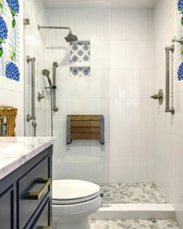
Cool colors (blues, greens, purples) promote calmness, serenity, and a sense of spaciousness. They are suitable for bedrooms, bathrooms, or areas where relaxation is a priority.
3. Monochromatic Color Scheme
A monochromatic color scheme involves using variations of a single color. This creates a sophisticated and cohesive look while allowing for subtle variations in tone and shade.
4. Analogous Color Scheme
Analogous colors are adjacent on the color wheel. This scheme is pleasing to the eye and provides a unified, harmonious feel. For example, using blue, blue-green, and green together.
5. Complementary Color Scheme
Complementary colors are opposite on the color wheel. When paired, they create a high contrast and vibrant look. However, it’s essential to balance them to avoid overwhelming the space.
6. Split-Complementary Color Scheme
This scheme uses a base color and the two colors adjacent to its complementary color. It provides high contrast while maintaining harmony.
7. Triadic Color Scheme
Involves three colors equidistant from each other on the color wheel. This scheme provides a balance of contrasting colors and is often used in larger spaces.
8. Tetradic Color Scheme
Utilizes four colors together in the form of two complementary color pairs. This scheme offers plenty of color variety and balance when used correctly.
9. Neutral Colors
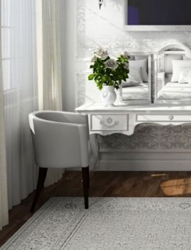
Whites, grays, and browns serve as neutral colors in interior design. They can be used as a backdrop to highlight other colors or as the dominant palette for a clean, minimalist look.
10. Psychological Effects of Color
Consider the psychological impact of colors. For example, red may stimulate appetite, while blue promotes calmness. Understanding these effects can help tailor the color scheme to the function of the space.
Remember that personal preferences, cultural influences, and the specific function of the space should also guide color choices in interior design.
Experimenting with color in small doses through accessories, textiles, or accent walls can be a great way to find the perfect balance for a given space.
Ready to get started? Contact us.