- September 5, 2023
- Martha
The power of color is undeniable when it comes to design.
Whether it’s for graphic design, interior decoration, fashion, or any other creative field, choosing the perfect color palette can greatly influence the mood, perception, and overall impact of your work.
Here’s a guide to help you choose the perfect color palette:
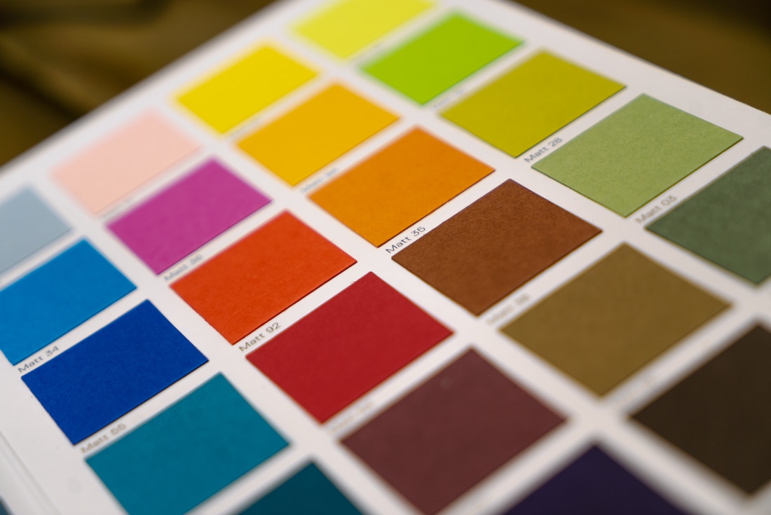
1. Understand Color Theory
Before diving into selecting colors, it’s essential to have a basic understanding of color theory. This involves learning about the color wheel, color relationships, and how colors interact with each other.
The primary color wheel includes red, blue, and yellow, while the secondary colors are green, orange, and purple. Complementary, analogous, and triadic color schemes are some of the common color relationships you can explore.
2. Define the Mood and Purpose
Consider the emotional response you want to evoke and the purpose of your project. Different colors evoke different feelings. For example, warm colors like red, orange, and yellow are energetic and passionate, while cool colors like blue, green, and purple are calming and soothing.
Consider whether you want your design to be playful, professional, elegant, or vibrant.
3. Research Your Audience
Understand your target audience and their preferences. Different demographics and cultures have varying perceptions of color. Colors that appeal to one group might not have the same effect on another.
Research your target audience’s cultural backgrounds, age groups, and preferences to make informed color choices.
4. Start with a Base Color
Choose a base color that will dominate your palette. This color will set the tone for your design. It could be a color that aligns with your brand or the mood you want to convey.
You can use tools like Adobe Color, Coolors, or Color Hunt to explore and generate color palettes based on your chosen base color.
5. Create Color Harmony
Select additional colors that harmonize well with your base color. These can be analogous colors (colors that are next to each other on the color wheel), complementary colors (colors that are opposite each other on the color wheel), or triadic colors (colors that are evenly spaced around the color wheel).
Using a harmonious color palette will ensure a visually pleasing and balanced design.
6. Consider Contrast and Accessibility
Ensure there’s enough contrast between the colors to enhance readability and visibility. High contrast is crucial for text legibility, especially in designs involving typography.
Additionally, consider accessibility by choosing colors that are easily distinguishable by individuals with color vision deficiencies.
7. Limit Your Palette
While it’s tempting to use a wide range of colors, it’s usually best to limit your palette to around 3-5 colors. Too many colors can create visual chaos and dilute the impact of your design. A limited color palette promotes cohesion and makes your design more memorable.
8. Test and Iterate
Don’t be afraid to experiment with different color combinations. Test your color palette in various contexts to see how it looks on different devices, backgrounds, and lighting conditions. Iterate based on feedback and your own observations.
9. Use Color Psychology Wisely
Colors have psychological associations, so be mindful of the context in which you’re using them. For example, blue is often associated with trust and professionalism, while red can evoke excitement or urgency.
10. Stay Consistent
Consistency is key in design. Once you’ve established your color palette, use it consistently across all your design elements, whether it’s a logo, website, brochure, or any other medium. This creates a unified and cohesive visual identity.
Remember that choosing the perfect color palette requires a combination of creativity, an understanding of color theory, and consideration of your project’s objectives.
Don’t be afraid to experiment and trust your instincts while keeping the fundamental principles of color theory in mind.
Need help finding your perfect color palette? Contact us.