- March 4, 2026
- Martha
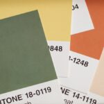
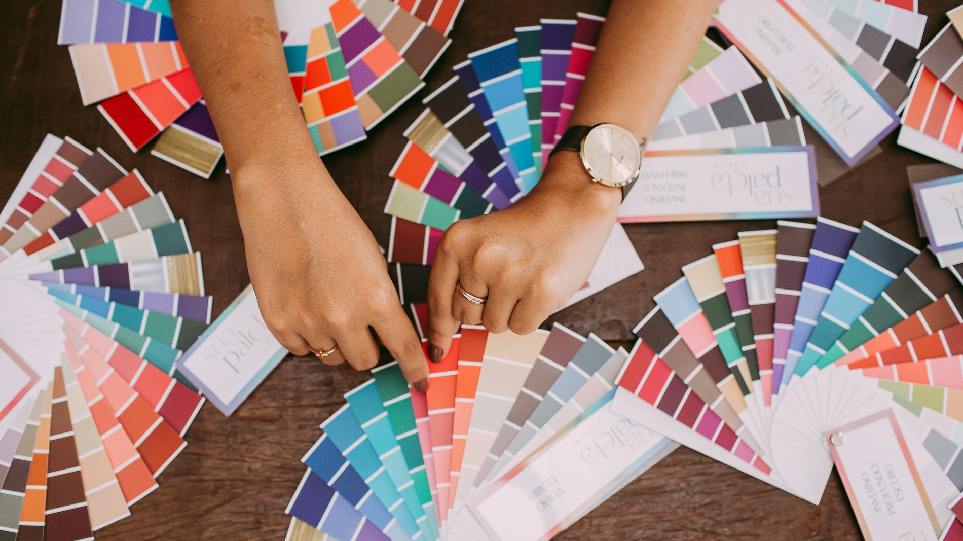
Color plays a defining role in how we experience interior spaces.
From influencing mood to shaping spatial perception, color strategy is both a psychological tool and a design statement. Here’s a detailed look at modern color strategies and the latest painting trends in interior design.
1. Strategic Use of Color in Interior Design
1.1 Mood-Based Color Selection
Different colors evoke different emotional responses:
- Blues & Greens → Calm, focus, serenity (ideal for bedrooms, offices)
- Warm Neutrals → Comfort, stability (living rooms)
- Yellows & Corals → Energy, creativity (kitchens, studios)
- Deep Charcoal & Navy → Sophistication, intimacy (dining rooms, libraries)
Designers often use color psychology to align spaces with their function.
1.2 The 60-30-10 Rule
A classic design principle:
- 60% Dominant color (walls)
- 30% Secondary color (furniture/upholstery)
- 10% Accent color (decor pieces)
This ensures visual balance and prevents overwhelming contrast.
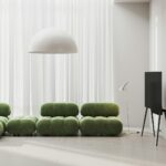
1.3 Monochromatic & Tonal Layering
Instead of high contrast, many modern interiors use variations of the same hue:
- Light sage + olive + deep forest
- Soft beige + taupe + chocolate
This creates depth while maintaining harmony.
1.4 Color Zoning
Especially popular in open-plan homes:
- Use color blocks to define dining, working, and relaxation zones.
- Half-painted walls or vertical panels subtly separate spaces.
2. Current Painting Trends (2025)
2.1 Earthy & Nature-Inspired Palettes
Inspired by sustainability and biophilic design:
- Clay, terracotta, olive, mushroom gray
- Muted desert tones
- Warm sand beiges
These tones create grounded, organic interiors.
2.2 Soft, Muted Blues & Green-Grays
Replacing stark grays, we now see:
- Dusty blue
- Eucalyptus green
- Stormy blue-gray
These colors add subtle personality without overwhelming a space.
2.3 Deep Moody Interiors
Rich, dramatic shades are trending:
- Midnight blue
- Aubergine
- Deep emerald
- Matte black accent walls
Often paired with brass or textured fabrics for contrast.
2.4 Warm Minimalism
Cool whites are fading; warm whites and creamy tones dominate:
- Off-white with yellow undertones
- Soft ivory
- Linen-inspired hues
These make spaces feel softer and more welcoming.
2.5 Textured & Specialty Finishes
Flat paint is no longer the only option:
- Limewash walls
- Roman clay finishes
- Color-drenching (painting walls, ceiling, trim the same color)
- Subtle gradient or ombré effects
Texture adds depth even in neutral palettes.
2.6 Statement Ceilings
Ceilings are becoming the “fifth wall”:
- Bold ceiling colors
- Soft pastel ceilings
- Gloss finishes for reflection
This adds architectural interest without clutter.
3. Choosing the Right Strategy for Your Space
Consider:
- Natural light exposure
- Room size (dark colors can make small rooms cozy, not necessarily smaller)
- Existing flooring and furniture
- Long-term adaptability
A good color strategy balances trend awareness with timelessness.
Quick Tips for Homeowners
- Always test paint samples on different walls.
- Observe colors at different times of day.
- Consider finish (matte vs satin vs gloss).
- Don’t fear dark colors — they can create elegance and warmth.
Ready to harness the power of color in your home? Let’s talk.