- February 16, 2026
- Martha
Color plays a powerful role in emotional regulation within interior design because it influences mood, energy levels, stress responses, and even cognitive performance.
Thoughtful color choices can help spaces feel calm, energizing, comforting, or mentally stimulating.
Here’s a structured breakdown:
How Color Affects Emotions
Colors trigger psychological and physiological responses:
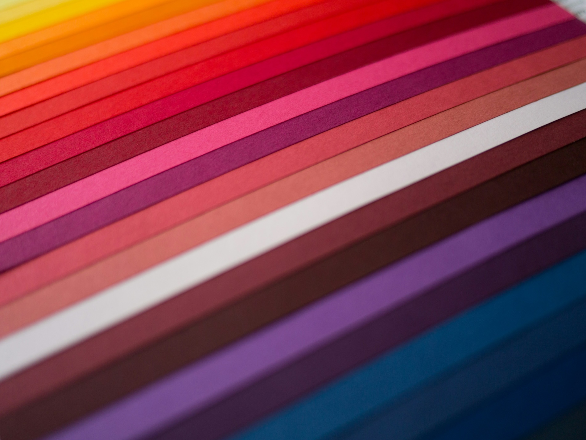
1. Warm Colors (Red, Orange, Yellow)
Associated with energy, warmth, and stimulation.
- Red → increases heart rate, intensity, passion, urgency
Overuse may cause agitation or stress - Orange → enthusiasm, sociability, creativity
- Yellow → optimism, cheerfulness
Bright yellow may induce anxiety if too saturated
Best for: Social areas, dining rooms, creative studios
Avoid heavy use in: Bedrooms, meditation spaces
2. Cool Colors (Blue, Green, Purple)
Linked to calmness, relaxation, and restoration.
- Blue → lowers blood pressure, calm, focus
- Green → balance, nature, recovery
- Purple → luxury, introspection, creativity
Best for: Bedrooms, offices, bathrooms, wellness spaces
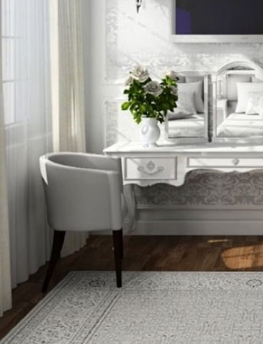
3. Neutral Colors (White, Beige, Gray, Taupe)
Provide emotional stability and visual rest.
- White → clarity, openness
Can feel sterile if unbalanced - Beige/Taupe → warmth, comfort
- Gray → sophistication
Excess cool gray may feel gloomy
Best for: Background palette, minimalist interiors
Color & Emotional Regulation Strategies
1. Reduce Stress & Anxiety
Use soft, muted cool tones:
- Sage green
- Dusty blue
- Warm off-whites
Avoid:
- Highly saturated reds
- Harsh contrasts
2. Improve Focus & Productivity
Use colors that support cognitive clarity:
- Soft blues → concentration
- Greens → mental balance
- Gentle neutrals → reduce distraction
Ideal for:
- Home offices
- Study rooms
3. Increase Energy & Motivation
Apply controlled warm accents:
- Terracotta
- Mustard
- Coral
Tip: Use as accent walls / décor, not full-room dominance
4. Promote Relaxation & Sleep
Choose low-arousal colors:
- Muted blue
- Lavender
- Warm gray
- Soft green
Avoid:
- Bright white
- Bold red
- Neon tones
Room-by-Room Guidance
Bedroom
Emotional Goal: Calm, safety, sleep
Recommended Colors: Dusty blue, sage, warm neutrals
Living Room
Emotional Goal: Comfort, connection
Recommended Colors: Warm beige, soft earth tones
Kitchen
Emotional Goal: Energy, appetite
Recommended Colors: Warm whites, muted yellow, soft green
Office
Emotional Goal: Focus, clarity
Recommended Colors: Blue-gray, muted green
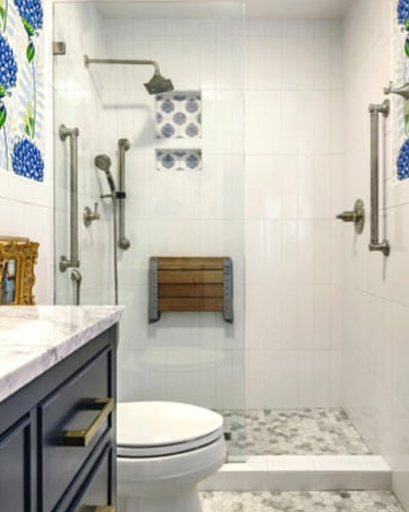
Bathroom
Emotional Goal: Relaxation, freshness
Recommended Colors: White + soft blue/green
Important Balancing Factors
Color impact depends on:
- Saturation (muted = calmer)
- Brightness (darker = cozy / lighter = airy)
- Lighting (natural vs warm artificial)
- Texture & materials (wood softens bold colors)
- Personal associations (culture & memory matter)
Advanced Design Tips
- Use color zoning to shape emotional transitions
- Combine cool base + warm accents for balance
- Apply darker tones for security/coziness
- Test colors under actual lighting conditions
- Consider biophilic palettes (nature-inspired hues)
Key Takeaway
Color isn’t just aesthetic—it’s a regulatory tool that can:
- Calm the nervous system
- Boost motivation
- Enhance focus
- Support sleep
- Shape perceived comfort
Ready to harness the power of color in your home? Let’s talk.